
This post was originally written by Dan Wolchonok (@danwolch). Dan was a Sr PM on the growth team I established HubSpot. Throughout the post I have added some commentary noted in italics.
I used to be the PM for one of HubSpot’s freemium email tools. It was a great experience launching something brand new in front of thousands of people at our annual conference, and then growing it to hundreds of thousands of active users. We watched our metrics extremely closely, and we knew how fast we had to grow to hit our goal for the next year. I would frequently get questions like “are we having a good week?” and I felt the pressure to give a reliable and accurate projection.
BB: One of our core metrics was Weekly Active Users. The challenge with a metric like WAU is that you don’t have final number until the end of the week, yet you want to know early in the week how you are doing. This is a view that analytics solutions like Mixpanel don’t really offer:

This is an example of what you might see in an analytics tool like Mixpanel at the beginning of a week. Not very helpful is it?
If things were going poorly, I needed to be able to understand why and sound the alarm so the team could take action. That said, you can’t have many false alarms. You don’t want to come across as the boy who cried wolf.
BB: As Dan mentions it is critical to know if thing are going poorly in real time, and not waiting until the end of some time frame. When we noticed a “blip” on the radar we always went through a series of questions to diagnose: Was there a holiday (domestic and international)? Did we change something with our acquisition channels? When/what were our product releases? Is support receiving an unusual amount of tickets? etc, etc. Blending the quantitative data with qualitative is important.
Constantly asking “why?” when we observed a change from the norm lead to learnings about usage patterns and behaviors with the product which lead to better predictions about expected performance.
I ended up building a simple model in Excel (Google Docs link) that helped me visualize the current week against previous weeks, so I’d be able to make a reasonable guess as to whether we would grow, hold steady, or lose ground.
BB: Over time we built these projections and graphs into our custom analytics. But some simple exports and excel will take you a really long way.
For example, lets say that 100,000 people used an app on a weekly basis (WAUs). Not every person used it every day, so our DAUs (daily active users) was less than 100,000. Lets say it was 65,000 DAUs. I recorded the cumulative number of people that had used our app so far that week. It looked like this:

I then added columns going back in time, and kept track of it going forward. This gave me a nice set of data to play around with:

The pattern of usage each week was incredibly consistent. I graphed each daily total against the final count of users active for that week:
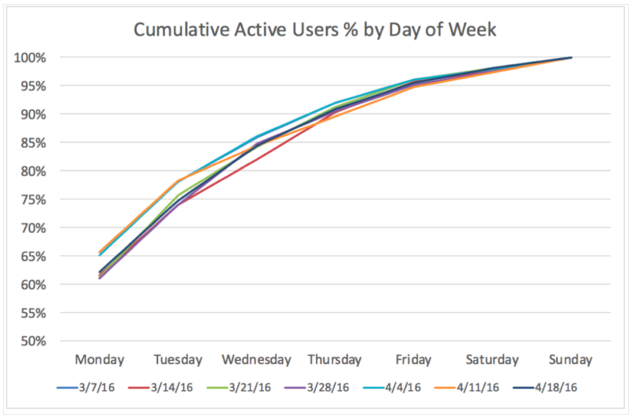
This chart shows that our pattern of usage each week is incredibly consistent. Between 60 and 70 percent of our weekly total uses in Monday, and between 75 and 80 percent of our users have used in by the end of the day Tuesday.
The way I read this chart is that we are better able to predict what our total user count will be by the end of the week. As our user base grows larger, it’s harder for our user acquisition to have as much of an impact on a week to week basis. New users can definitely increase, but that’s a good problem to have.
BB: As Dan mentions, this chart was important as it showed us we could predict within a certain level of accuracy early in the week. That helped us establish sensitivity analysis described below.
Using these numbers, I updated the model to project what the high and low bounds of what I’d expect for our total usage for the week:

BB: Overall we really emphasized that the team should be attached to the metrics and build a daily habit of reviewing them. Making it easy for the team to understand what is going on with the metrics in real time is part of that mission. You can do these types of reports for any non-daily metric to understand how you are projecting in real time.
Disclaimer: all of the data in this sample and the screenshots are fake. They were made up and not reflective of any HubSpot product

Comments